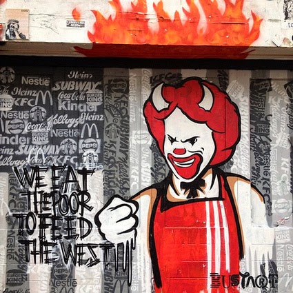
Tuesday 24 June 2014

General Inspiration for Order/Chaos project

My final piece on Order/Chaos, as explained in an earlier blog, is a piece that should 'talk' to the viewer and because of that I have firstly decided to show in this blog some works of art that speak: Art that causes an instant emotional reaction whether it is one of shock or shame or something quite different.

Banksy

Amsterdam /street /art

Anthony Freda

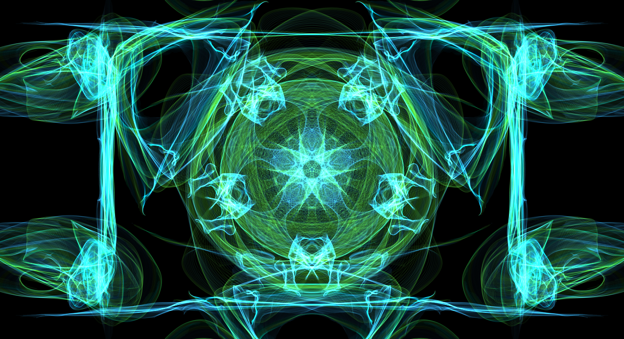
Art, I feel, is a powerful instrument in order to get a point across quickly and effectively. In a matter of seconds a thought can be projected. All of these artists demonstrate this and for my final piece I wanted to achieve the ability to 'speak' to the viewer and maybe even create some questions.


Secondly I want to show other works and other things that have inspired me to create my piece but more so in a visual sense rather than a socio-political one.

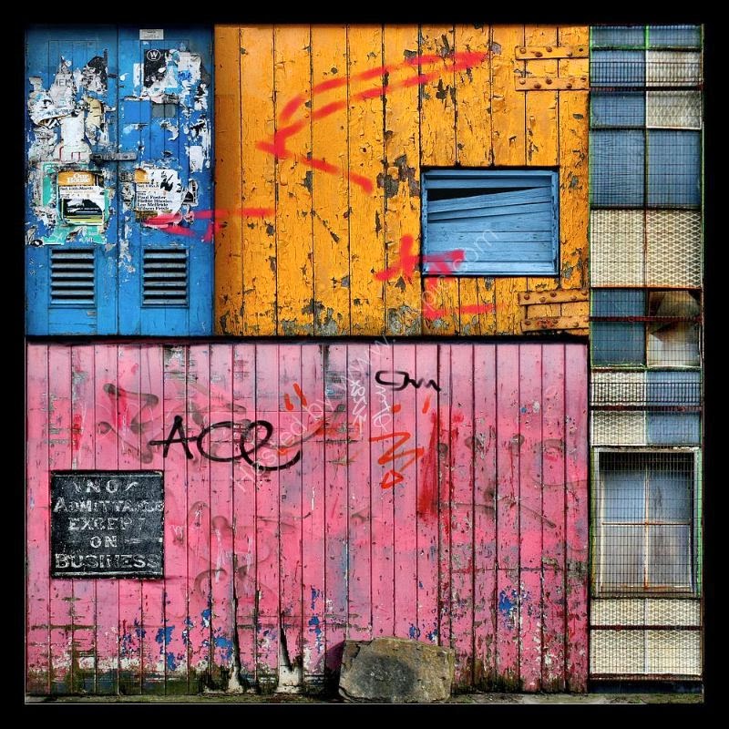
Daniel Shiel creates art using different photographs of parts of buildings and puts them together creating a colourful, gritty, urban style collage.
 
Michael Jeffery creates his art by use of spray paint, stencils and paint skins. I love his use of numbers and letters and how they 'make' the art complete.
 
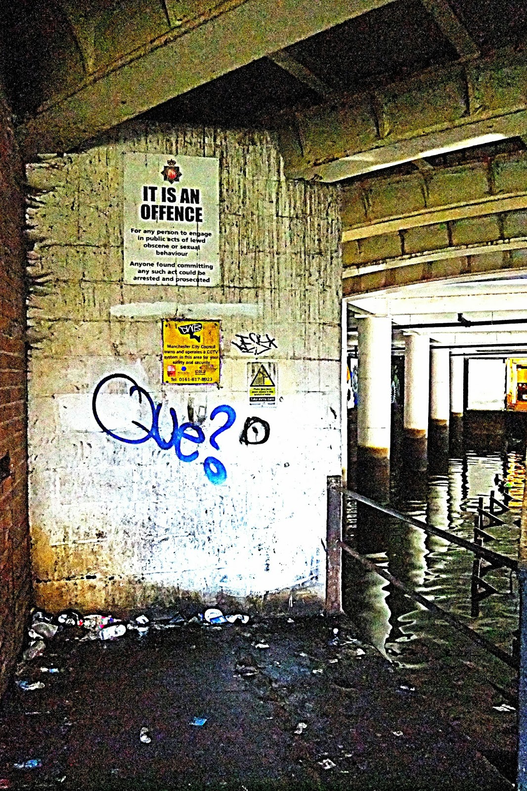
Thirdly I will enclose some photographs of my own to show, over the year, different things that have captures my attention and imagination.
 

 These a just some of the photographs taken around Manchester. I suppose they are of 'found incidental Art'. All have words and are communicating something to the viewer. However the fact that some of the words are now unrecognisable appeals to me also.


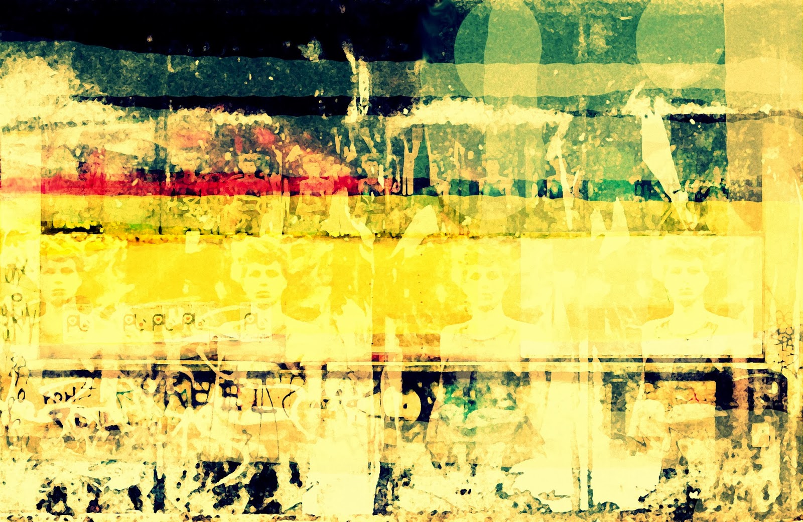
Finally I have decided to include a billboard that I came across in the Whitechapel area of London, and the photograph after I had altered the image on photoshop. Billboards, like this one, I feel, deliver so many different forms of art from so many different types of people. From the big men who sit in expensive chairs in security riddled tall buildings who want to send a message to the plebs, the graphic designers who created the worn images on the posters, the persons who partially boarded up the billboard because they were told to by the council, to the 'vandaliser' on the street.


All of these images and artworks have given me much inspiration over the course of the year. I hope I have shown the connection between these works and images and my final piece on Order/Chaos.


Sunday 22 June 2014

ORDER/CHAOS Final Piece and how it happened

I admit that I was unsure what direction I should go in when it came to making my final piece however over the year I had come to appreciate mess and rust and decay. I would stop and look at billboards that had been battered by the weather and the Human hand. I also felt very strongly about political issues and felt a need to express myself. We had recently had the opportunity to vote and I was feeling ashamed that I chose not to. This was because of a total lack of faith in any of the parties. Never the less I realise that I am not alone and many people are feeling at a loss with politics. There is the bigger election coming up and again I cannot say who I will vote for as the main three parties, I feel, have let the ordinary person down.
So along with these feelings and a love of billboards gone rotten I created a piece which I felt reflected order and chaos, not just because of the appearance but because of what the piece was saying. To vote and to choose not to vote out of ignorance or a total feeling of hopelessness in all directions available, to me indicates order/chaos.


THE MESSAGE
I worried that this may be offensive, but decided that, that's life. It is meant to represent a sort of graffiti and an attitude both ignorant and hostile as I think I am trying to show a dying society and community, and a battered approach to choosing our future when many people feel they don't really have a choice because all the pathways lead to the same place. Never the less the graffitti could be looked at as incidentual, next to the 'Vote' posters for some things in life may cause the question, is this a direct reaction to Austerity/Welfare cuts/lack of jobs etc? Or is it simply a result of a society broken by bad governance and a lack of Humanity and any real thought? Take the riots of 2011 for example. In my opinion those riots had no real thought or purpose. Simply they were opportunities for the chaotic youths to inflict vegence on what remains of society and the order of the country. However those terrible riots seemed to fit with the current wave of depression and hopelessness that was looming ahead at that time. It was not a protest to this, but in my opinion did reflect over 30 years of British governance gone wrong.
THE ARTWORK
The canvas has many layers of acylic paint added to it, often paint mixed with talcum powder to give it more texture and thickness. I have also glued on many bits of paper and then ripped them off again in an attempt to create a tatty look. The 'Vote' pieces were painted on a separate piece of paper and then photographed, tweaked on Picassa photo editing suit and then printed out and glued on, then rubbed and scraped in order to look aged. I also glued on photographs I have taken and changed on Picassa of building work but simply for the abstract effect it made. After this I painted with black acrylic onto the canvas the 'graffitti'. Not quite satisfied I then watered down different coloured ink and using a sponge swept it across different parts of the canvas. When this dried I added white acrylic paint dabbed on here and there. Then I used soft pastels to give the canvas a more rough edge and bring out some of the creases and folds made by the added bits of paper.


 Canvas with first layer of acrylic paint and talcum powder.


 The original photograph taken in Manchester and below is the photo altered on Picassa in both green/blue and pink/blue shades. These two pieces were stuck onto the canvas and ripped off leaving only fragments of their images left to be seen.
 The next stage of the canvas after paper and other acrylic paints had been added.
The 'Vote' piece, painted and altered on Picassa before being printed out and pasted onto the canvas

Friday 20 June 2014

Art/Chaos Influential Artist: Clark Russell

I had come across Clark Russell's artwork late last year and was instantly taken with the quirkiness of his creations.
Clark Russell was born in Missouri in 1961 and has been making art since 1984. As well as paintings and collages Clark Russell has found art in wall sculptures. The unusual aspect of his art comes from the fact that his sculptures are made from found objects. These objects are altered and assembled and then viewable from different points.
'They are of the world and unknown, content transformed, three dimensional combinations of rhyme and reason, chaos and cohesion, preservation and renewal, reality and potential.'
         Clarke Russell speaking of his Art

It seems an important aspect of Clark Russell's art that these sculptures are made from real life parts even though they are not necessarily recognisable as any particular thing. Reading on I find that Clark's fascination with found objects came from a time he found a bike seat. At first, he states, he was taken by it's symbolic nature, however after some time began to appreciate it's rusted surfaces, dangling springs and curvaceous shape. This was the beginning of an indulgence in wall sculpture made from found parts and I find that his work shows chaos and order combined. I am taken with his ability to alter these objects and appreciate the fact that these objects had a past and a purpose but now are part of a vision.
'A mixed media artist and musician who creates collages of objects and sounds, looking to share a vision rather than a point of view.'
         Birlington freepress.com


Wednesday 4 June 2014

Order/Chaos Influential Artist: Jackson Pollock (1912 - 1956)

Whilst researching various artist who appear to reflect order/chaos in their work I came across Jackson Pollock, an influential artist of post world war 2 America. Pollock became a master of Action Painting with his drip technique and floor style canvas endeavours which was part of the movement of abstract expressionism. The aftermath of WW11 created social conditions influenced by anxiety leading to this style of Art.
Collectors want paintings which seem alive to them, surcharged with energy, or excitement, or emotional connotations...
Aline Louchheim. Artnews July 1st 1944

Even much later Pollock's work showed connections to American Nationalism, perhaps indicating that there was order and thought in the appearance of chaos. Some might have even seen exhibiting Pollock's work in these times as part of a plan.

In the 1980s art was seen as part of the social discourse and Pollock's paintings were treated as social documents. The discerning viewer or perhaps the patient code breaker could read that exhibiting Pollock's work was part of a strategic plan to achieve American Supremacy in the Cold War...
Jeremy Lewison. Interpreting Pollock. Tate Gallery Publishing 1999

However whilst Pollock's work showed no sign of overt nationalism, his art held the energy and chaos which America so desired both during and after WW11 and in later years showed powerful influence on the thoughts and suspicions of the people.

Jackson Pollock had been introduced to the use of liquid paint in 1936 by David Siqueiros and paint pouring was one of several techniques he used, tacking a large canvas to the floor and using his whole body to paint, he certainly appeared to show chaos perhaps reflected by national anxiety in his work. Never the less some years later a certain mathematical order was detected. Physicists Richard Taylor, Micholich and Jonas determined that some of Pollock's works displayed properties of mathematical fractals. Indicating that Pollock may have had a intuition of the nature of chaos motion 10 years or more before chaos theory was proposed.

In my opinion there is order in the chaos of Pollock's work, even if it is from deep within the subconscious. Also I feel the viewer may find the order of  American Nationalism in Pollock's art through a united recognition of what Pollock's paintings indicate, whether true to this notion or not.


                                              Secret Of The Guardian 1943

                                            Blue Poles (Number 11) 1953

Friday 4 April 2014

Weavesilk; My experiment in stages

As part of Art and Design in computers I tried my hand at Weavesilk. What I have done here is to show in stages the progression of my work. The 1st picture is an attempt of just a few lines in 2 fold rotational symmetry, the 2nd picture shows 3 fold rotational symmetry added to it. The 3rd shows 4 fold, then 5 fold and finally the 5th picture shows my completed Weavesilk experiment in 6 fold rotational symmetry added to all 2, 3, 4  and 5 fold past experiments.


Friday 31 January 2014

Cubism and Cubist Artists

There is a debate over who invented Cubism, however for a painting to be a true cubist painting it must involve the three main ingredients which are:
GEOMETRICITY: Simplified objects and figures which may or may not result in the whole figure or object resembling that which we know in the natural world. It is also an approximation of the 4th dimension and is conceptual instead of perceptual reality.
PASSAGE: Overlapping and interpenetration of planes.
SIMULTANEITY: Different points of view made visible on one plane. Multiple views of objects and figures.
The argument goes that either Georges Braque or Pablo Picasso invented Cubism. Textbooks often hail Picasso's Les Demoiselles d'Avignon as the first Cubist painting as it involved the three main ingredients of Cubism; Geometricity, Simultaneity and passage. However this painting was not displayed until 1916, even though painted in 1907.
Georges Braque however delivered a series of paintings and many say that Houses at L'Estaque is the first Cubist painting which was influenced by Cezannes landscapes and painted in 1908. These paintings by Braque also urged art critic Louis Vauxcelles and Henri Mattisse to describe the paintings to be 'nothing but little cubes'. Hence the name Cubism was formed.
I think it fair to say that both Braque and Picasso created cubism, which was further developed by Juan Gris, who is described as the Third Cubist Painter. His paintings are described as more calculated than Picasso's and Braque's, with every line, shape, tone, colour and pattern being carefully refined.
There are four 'Cubism' periods.
Early Cubism or Cezannism (1908 - 1910)
Analytic Cubism (1912 - 1914)
Late Cubism (1915 - present)

Pablo Picasso: Les Demoiselles D'Avignon

Georges Braque: Houses at L'Estaque

Juan Gris: Harlequin with Guitar


Tuesday 7 January 2014

Inspiration for Urban Landscape final piece: John Piper and L S Lowry

For my final piece for the Urban Landscape project my inspiration came from art mainly created by John Piper and L S Lowry, however I did ponder whether I should go into a more abstract form of art. Never the less I felt that for this particular assignment; buildings, town and city scenes, urban life, I wanted to paint a picture that showed the observer the streets and buildings of the city rather than focus on shapes and colours that show a hint of the scene I had in mind to project.
Both John Piper and L S Lowry, in my opinion created scenes which are recognisable and yet show personality and imagination. I also feel there is a sense of freedom with both Piper and Lowry to paint a picture the way they felt it should look rather that how it may actually appear in real life.


I was taken by John Piper's art and found his choice of scenes to paint to be most impressive. Without too much emphasis on a very life like painting his art shows brilliant colour and imagination. I felt I leaned towards the style of John Piper whilst attempting my own urban landscape scene. His colours are quite over the top and enhanced and I wanted to deliver strong saturated colours in my art.


L S Lowry who was famous for his paintings of the North of England in the mid 20th century and his matchstick men was a huge inspiration to me. I liked his naive approach to painting and again I liked his use of colour within the dusty streets and scenes. Because of this I felt an urge to paint old mills and grotty smokey scenes also but I chose a scene which had both yesterdays buildings and today's more modern buildings together.
My final piece is taken from a photograph I took of a scene in Manchester and I wanted to show buildings both old and new.