Lately I have become quite enthusiastic regarding mixed media art. Therefore I decided to research urban landscape artists that use this style of art for their work and I came across Liz Brizzi who's art work stands out with quality and seems to reflect desolation and decay. She seems to have found the knack of producing work with that scratchy and distressed atmosphere whilst still retaining colour.
Reading up on Liz Brizzi I find that her inspiration for her art comes from the industrial aspects of big cities and she has created numerous pieces centred around LA.
Liz's unique style starts with her own original photographs. She works with the idea of a 'mood' of a painting and uses the photographs she has that 'speak to her', tweaking them on photoshop, cutting them and creating a photo montage. Liz then places this photo montage onto an acrylic painted wood panel and then blends with layers of colourful acrylic washes.
Below are some examples of her work.
Monday, 16 December 2013
Quick Sketches
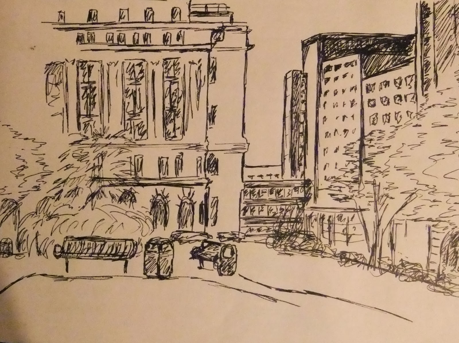
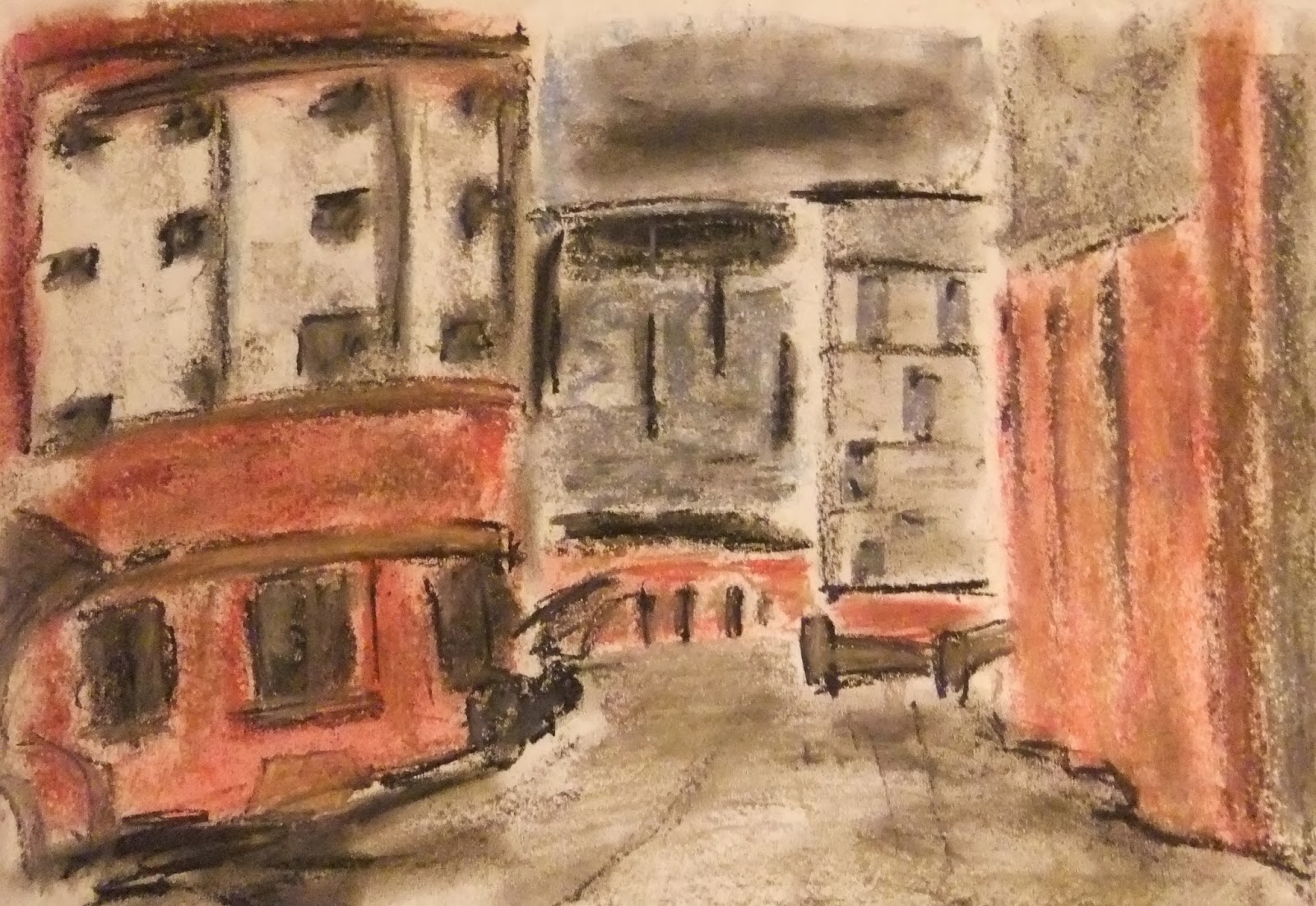
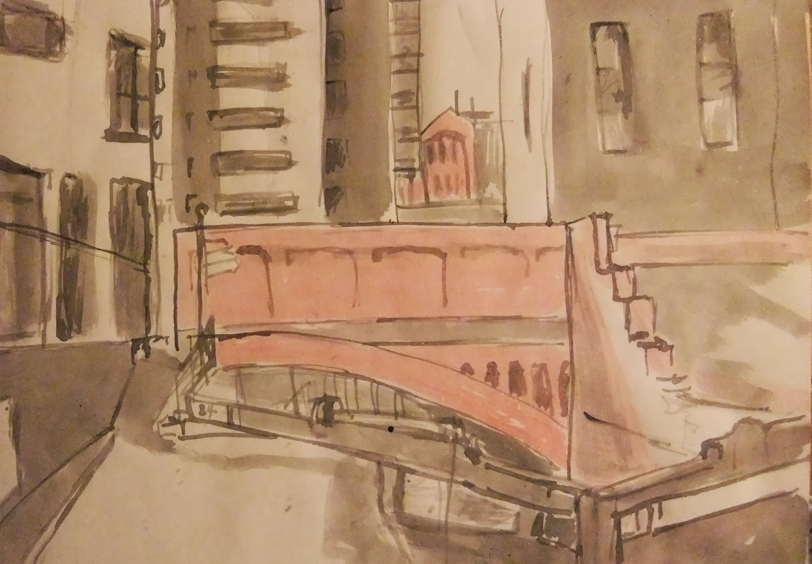
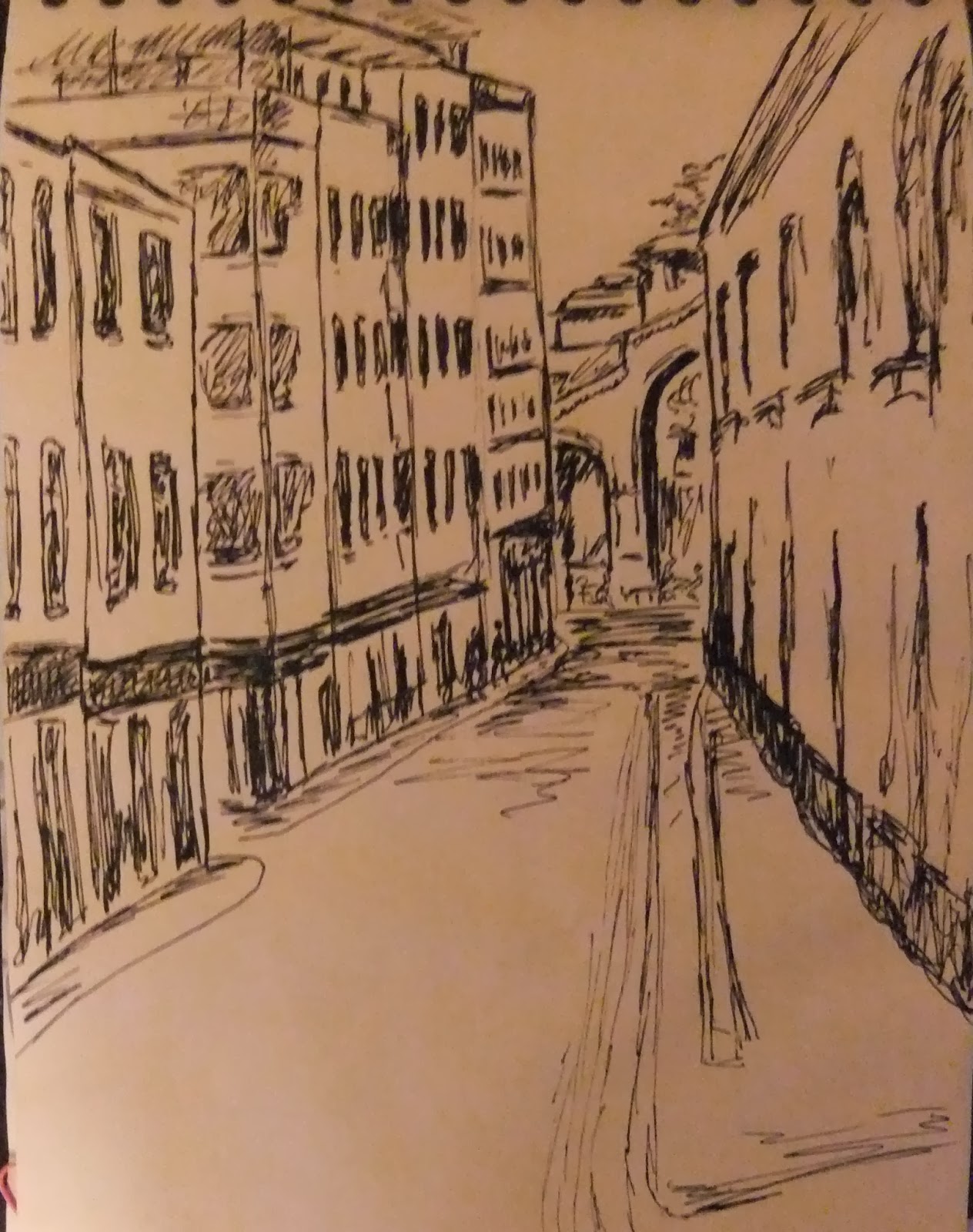
I have found that Sketches can be a good way to find out if a scene works for me and therefore helping me to make the decision as to whether to work with that scene in a larger or more complex project.
Here are some of my sketches that I have completed during my time at college:
![]() |
| Sketch from life using ink pen |
![]() |
| sketch from life using soft pastels |
![]() |
| sketch from photo using red and black ink |
Urban Landscape Artists Research: Nathan Walsh
Nathan Walsh is an interesting artist, not only because his paintings are extremely life like but because his artistic technique involves extremely complex drawings resembling that of an architechural blueprint.
Many artists use a camera or computer software for the base of their paintings and work with that to complete their finished piece, however Nathan Walsh interestingly rejects this technique and instead relies on his drawings of certain chosen scenes. Walsh prefers to use his Human eye therefore giving him the chance to make pictorial decisions. With mathematical structure he is able to give his art a sense of 'real life'. His Paintings are geometrically perfect looking but actually give a sense of perhaps 'bent space'. This could question the Human eye's perception of the world and that which surrounds us.
"Working with a box of pencils and an eraser I will start establishing an horizontal line on which I will place vanishing points to construct simple linear shapes which become subdivided into more complex arrangements." Nathan Walsh.Walsh's paintings take up to three or four months to complete. Here are some examples of his work.
Sunday, 15 December 2013
Urban Landscape final piece: Evaluation
After careful consideration regarding the many different ways I could achieve my final piece I decided to use acrylic paints. I have enjoyed using watercolour, soft pastel, ink, etc (please see previous post) however I wanted to put forth a painting which looked almost saturated in colour and so I decided that acrylic paints were possibly a good option to use for this effect.
When it came to starting the painting I knew that the way I work tends to involve 'not putting the paint brush down'. I realise that I work best this way and if I put a painting away for a few days I may not finish it. I tend to work intensely for most of the day or days for that matter in order to get a piece of art finished. This particular painting was done over two days using acrylic paints, brushes, card and sponge from one of my own photographs of an urban landscape scene in Manchester. I started by painting a pale cream/yellow background with a wide brush, and then using the card I scraped the shapes of the different buildings onto the canvas. Then I started to add the detail, slowly building the painting up. After taking the painting to college and having words with Tony I decided to work more on the painting as I felt that some of it was a little too harsh especially the blacked out part in the bottom left hand corner, so I lightened the original photograph on my computer so I see more of the detail in the darker areas and then I painted in those parts over the blacked out area.
Here are photographs of the stages of my painting before completion.
When it came to starting the painting I knew that the way I work tends to involve 'not putting the paint brush down'. I realise that I work best this way and if I put a painting away for a few days I may not finish it. I tend to work intensely for most of the day or days for that matter in order to get a piece of art finished. This particular painting was done over two days using acrylic paints, brushes, card and sponge from one of my own photographs of an urban landscape scene in Manchester. I started by painting a pale cream/yellow background with a wide brush, and then using the card I scraped the shapes of the different buildings onto the canvas. Then I started to add the detail, slowly building the painting up. After taking the painting to college and having words with Tony I decided to work more on the painting as I felt that some of it was a little too harsh especially the blacked out part in the bottom left hand corner, so I lightened the original photograph on my computer so I see more of the detail in the darker areas and then I painted in those parts over the blacked out area.
Here are photographs of the stages of my painting before completion.
Monday, 18 November 2013
Urban Landscape: Reflection
As we're reaching the end of the Urban Landscape project and we have been urged to consider a method and image for use on our main piece I have been looking over some of the pieces I have created so far and trying to decide which I'm most pleased with. I have used Watercolour paints, Acrylic paints, Ink, Soft Pastels and Collage or Mixed Media, and even a Photoshop piece that I'm quite happy with. However it is difficult for me to pick a favourite one.
Acrylic with Pastels: I have found that I'm quite happy to work with acrylic paints and enjoy mixing colours for the right shade. I also have found using a simple piece of card to paste the paint onto the canvas/card to be very pleasing. However I also like to use a brush and then sponge over for effect. What's more I find adding a little soft pastel to the final touches after the paint has dried works very well.
Watercolour: I was surprised to find that I liked working with watercolour as I have been avoiding it for years. I have realised that extra care has to be taken as mistakes can't be painted over like acrylics. Whites and light spaces can be a problem although masking tape and masking fluid can help keep these parts from being drowned in colour. Another golden rule with watercolour is stay away from the black and mix blue and brown instead. This advice helped tremendously.
Mixed Media/Collage: I found this style to be really enjoyable as it was a messy off the wall project that didn't really have any rules. The picture completely came out of my head and I didn't even have a plan to start with, which can be a lot of fun. However I had decided that the piece shouldn't have to make sense but instead imitate a mixture of ideas and moods. I used some of my own photographs along with acrylic paint and shredded pieces of paper glued on to the piece for effect.
Ink: I got the idea to work with ink through the first textile art class with Tom however chose to use a sponge to add my background colours and then added dark ink over the top to add the detail of walls and windows etc.
Photoshop: The photoshop painting was taken from a photograph I took a few months ago of a demolished house in Bolton. I simply added the paintbucket effect using a variety of colours and then used the smudge effect to create a melting type scenario after which I added a few faint large strokes of paintbush in some areas and then I added the 'Dark Strokes' effect which gave the painting a touch more depth and atmosphere whilst still retaining the colourful abstract style.
Here are some of my art pieces.
Acrylic and Pastels
Acrylic and Pastels
Watercolour
Mixed Media/Collage
Ink
Photoshop
Acrylic with Pastels: I have found that I'm quite happy to work with acrylic paints and enjoy mixing colours for the right shade. I also have found using a simple piece of card to paste the paint onto the canvas/card to be very pleasing. However I also like to use a brush and then sponge over for effect. What's more I find adding a little soft pastel to the final touches after the paint has dried works very well.
Watercolour: I was surprised to find that I liked working with watercolour as I have been avoiding it for years. I have realised that extra care has to be taken as mistakes can't be painted over like acrylics. Whites and light spaces can be a problem although masking tape and masking fluid can help keep these parts from being drowned in colour. Another golden rule with watercolour is stay away from the black and mix blue and brown instead. This advice helped tremendously.
Mixed Media/Collage: I found this style to be really enjoyable as it was a messy off the wall project that didn't really have any rules. The picture completely came out of my head and I didn't even have a plan to start with, which can be a lot of fun. However I had decided that the piece shouldn't have to make sense but instead imitate a mixture of ideas and moods. I used some of my own photographs along with acrylic paint and shredded pieces of paper glued on to the piece for effect.
Ink: I got the idea to work with ink through the first textile art class with Tom however chose to use a sponge to add my background colours and then added dark ink over the top to add the detail of walls and windows etc.
Photoshop: The photoshop painting was taken from a photograph I took a few months ago of a demolished house in Bolton. I simply added the paintbucket effect using a variety of colours and then used the smudge effect to create a melting type scenario after which I added a few faint large strokes of paintbush in some areas and then I added the 'Dark Strokes' effect which gave the painting a touch more depth and atmosphere whilst still retaining the colourful abstract style.
Here are some of my art pieces.
Tuesday, 5 November 2013
Archan Nair
I've decided to include Archan Nair in my blog on artists that inspire me. I enjoy his use of colours and themes and the unique technique he uses in expressing his imagination through visual art.
Archan Nair was born in 1982 in New Delhi. He is a self developed visual artist, illustrator and art director who specialises in mixed media, illustration and digital art. His inspiration for his art comes from the various phases of life we go through. Archan Nair creates works of art that connect the different dimensions of our existence.
Various publications which have featured Archan include Computer Arts, Digital Arts, Advanced Photoshop, GQ, Bak and Vanity Fair and his client list includes names such as Nike, Rolling Stone, Microsoft and Vogue.
Archan Nair is proving to be a popular artists with a spiritual edge. Below are just a few examples of his work.
Archan Nair was born in 1982 in New Delhi. He is a self developed visual artist, illustrator and art director who specialises in mixed media, illustration and digital art. His inspiration for his art comes from the various phases of life we go through. Archan Nair creates works of art that connect the different dimensions of our existence.
'I feel being original and discovering your own true essence is truly important. Love what you create. Imagination is the only knowledge and when we listen to our heart we have access to that knowledge.' Archan Nair
Various publications which have featured Archan include Computer Arts, Digital Arts, Advanced Photoshop, GQ, Bak and Vanity Fair and his client list includes names such as Nike, Rolling Stone, Microsoft and Vogue.
Archan Nair is proving to be a popular artists with a spiritual edge. Below are just a few examples of his work.
Tuesday, 8 October 2013
A Little Piece of David Hockney
Although I am still a little afraid of technology I am quite taken with Ipad art and so can understand why David Hockney feels that the Ipad, Iphone and no doubt various different means of technology that are yet to entice us, will be the way that artists will prefer to deliver their work. While I accept that this medium is an important asset to our technological world, I don't tend to agree with this totally. I believe that some artists will find that they prefer the hands-on approach of real paint, ink, glue, paper and scissors and the mess that comes with it. It has been said that drawings, like songs will always be around but just delivered differently. Even so I believe that some musicians still prefer tape to cubase and playing a real instrument beats inputting instructions on a computer programme. So no, I'm not entirely convinced but that doesn't mean that I don't appreciate Ipad art and the fun of experimenting and creating using different mediums. What's more I certainly do consider Hockney's work to be most impressive and extremely inspiring.
Even before the Ipad was a twinkle in a soon-to-be-rich man's eye, Hockney showed strong signs of attraction for the use of technology in art. In the 1980s he used one of the first colour photocopier's to create a series of works named 'Handmade Prints.' Hockney also repeated this technique with a fax machine.
However it was in 2008 that he discovered the Iphone and only a little while later that he found the Ipad and now is a keen Iphone and Ipad artist, sending drawn flowers to friends every morning.
Even before the Ipad was a twinkle in a soon-to-be-rich man's eye, Hockney showed strong signs of attraction for the use of technology in art. In the 1980s he used one of the first colour photocopier's to create a series of works named 'Handmade Prints.' Hockney also repeated this technique with a fax machine.
However it was in 2008 that he discovered the Iphone and only a little while later that he found the Ipad and now is a keen Iphone and Ipad artist, sending drawn flowers to friends every morning.
Subscribe to:
Posts (Atom)